Digital bi-lingual form
Problem
Filling out forms on digital devices can be slow and prone to errors, especially for multilingual users who need translations for clarity. Often digital forms either force users to select a single language or require switching between languages. This inefficiency negatively impacts form completion speed and data accuracy, particularly in high-stakes environments like healthcare, government services, or customer onboarding.
Goal
To design a digital bi-lingual form that supports multiple languages at the same time. The forms will be displayed on portable devices (iPad / Android tablets), and must accommodate at least any 2 languages.
The goal is to increase the speed of form completion and increase data accuracy.
-

Introductory Page
First, I started with introductory screen for a user to set their preferences: languages and their sequence, also adjust size of a text and buttons.
-

Progress Indicator
Once a User starts filling in the form, a Progress Indicator should be well seenable throughout the whole process to provide clarity.
I avoid showing approximate amount of minutes required to fill in the form, as I believe that every User is unique and it might give them wrong expectations.
Each section of a Progress Indicator has clear title. Also important to clearly state, if a user will need some additional documents, so they could prepare it. Section with multiple sub-sections will be expandable.
Also a User will be able to change content size and sequence of languages at any time to allow flexibility.A Back button is visible on the left upper corner as per best practices.
-
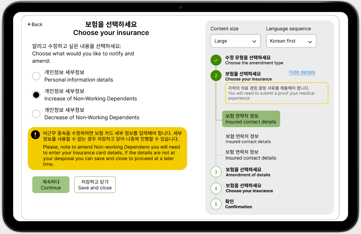
Alert Message
I’ve placed a note that a user will need to prepare Insurance card details before continuing to the next page. So they could Save and close in case if they do not have that info near.
-

Error Feedback
On this screen presented Error Feedback. A section with error is highlighted in red and the error message explains what went wrong.
Also, important to note, with help of AI it is possible to notice a possible error (for example, previously input information differed) then it is useful to notify a user about possible error and let them proceed with the information if a user is sure in correctness of it.
-

Numeric Input Field
Here are examples of Numeric Input Field. I avoid using Range Slider, as it is hard to get there precise number. Also when it comes to monetary amount in bilingual form, it is important for a user to be able to choose currency.
-

Various Input Fields
On this screen I brought examples of different input fields.
-

Review and Confirmation page
Another important item for forms in general is ability to check and confirm the correctness of input data. So for that, I divided each section of the form into separate boxes for better visibility. Each box has it’s own Edit button, so a user can edit only that specific part of the form avoiding getting to the start of the form or clicking on continue for other sections which do not need edit.
-

Success Confirmation
Final screen - is a confirmation of successful form submissions. Also it’s important to store that confirmation in the account history. Also there is a Return to the Home Page button.